Indifference Curves Explained: Mapping Consumer Preferences for Ultimate Satisfaction
Have you ever stood in the grocery aisle, weighing the choice between two different snacks? Or perhaps you’re planning a vacation and trying to decide between more days relaxing on the beach versus more thrilling adventure excursions? These everyday dilemmas, where you’re trying to get the most "bang for your buck" or, more accurately, the most "satisfaction for your choices," are at the heart of microeconomics.
Understanding how consumers make choices is fundamental to economics, marketing, and even public policy. But how do economists model something as abstract as "satisfaction" or "preference"? Enter the Indifference Curve – a powerful, yet surprisingly intuitive, tool that helps us visualize and understand consumer preferences.
In this comprehensive guide, we’ll break down indifference curves, explaining what they are, why they matter, and how they help map out the complex world of consumer choice. Get ready to gain a deeper understanding of the forces that drive your own purchasing decisions!
What Exactly Are Indifference Curves? The "Satisfaction Map"
Imagine you’re at an all-you-can-eat buffet. You love both pizza and soda. How much pizza would you be willing to give up for an extra soda, while still feeling just as happy? This is the core idea behind an indifference curve.
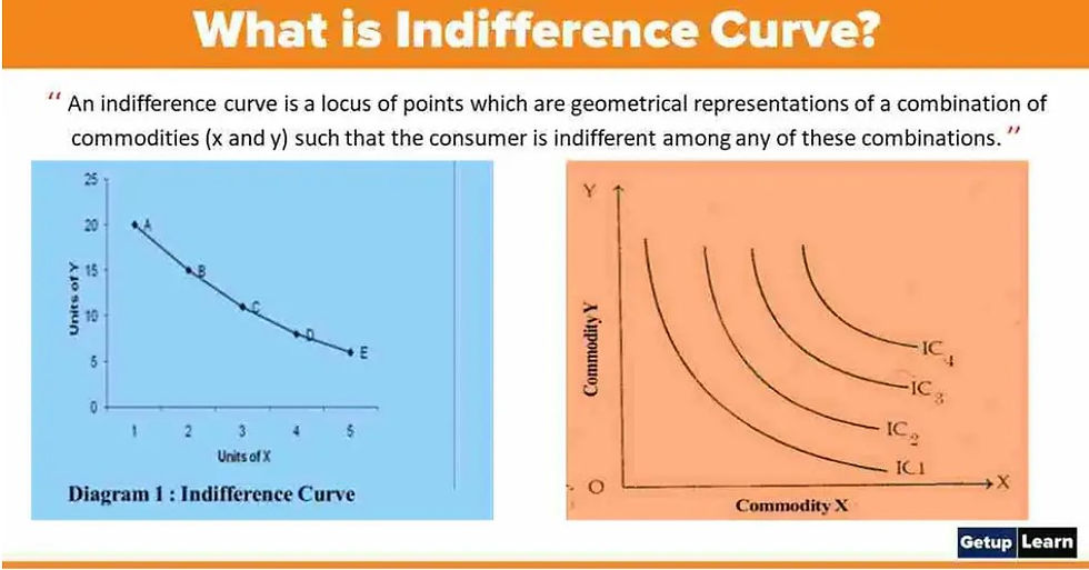
An Indifference Curve is a graphical representation showing various combinations (or "bundles") of two goods or services that yield the same level of satisfaction (or "utility") to a consumer.
Think of it as a "satisfaction map." Every point on a single indifference curve represents a different mix of two items (say, X and Y) that leaves you feeling equally content. You are "indifferent" to choosing any one point over another on the same curve because they all provide the exact same level of overall happiness or utility.
Key Takeaways:
- Two Goods: Indifference curves typically illustrate choices between two goods or services.
- Equal Satisfaction: All points on a single curve represent the same level of consumer satisfaction.
- Indifference: The consumer has no preference for one bundle over another on the same curve.
The Foundation: Utility and Consumer Preferences
Before we dive deeper into the curves themselves, let’s briefly touch upon the concepts that underpin them:
1. Utility: The Measure of Satisfaction
In economics, utility refers to the satisfaction, pleasure, or happiness a consumer derives from consuming a good or service. While we can’t put a precise numerical value on happiness (e.g., "This pizza gives me 7 utils of satisfaction"), we can certainly say we prefer one thing over another.
- Ordinal Utility: Indifference curves are based on the concept of ordinal utility. This means we can rank our preferences (e.g., I prefer bundle A to bundle B, or I am indifferent between bundle C and bundle D), but we don’t assign specific numerical values to the level of satisfaction. It’s about "more or less" or "equal," not "how much."
2. Bundles of Goods
When we talk about choices, we’re talking about bundles of goods. A bundle is simply a combination of specific quantities of two different goods.
- Example: If Good X is "Movies" and Good Y is "Books":
- Bundle A: 5 Movies, 2 Books
- Bundle B: 3 Movies, 4 Books
- Bundle C: 7 Movies, 1 Book
The indifference curve helps us see which of these bundles (or other combinations) provide the same level of satisfaction.
The Shape and Properties: What Makes an Indifference Curve "Indifferent"?
Indifference curves aren’t just random lines. They possess specific properties that reflect the fundamental assumptions economists make about consumer behavior. Understanding these properties is crucial to interpreting them correctly:
1. Indifference Curves are Downward Sloping (Negative Slope)
- Meaning: If you consume more of one good (e.g., pizza), you must consume less of the other good (e.g., soda) to maintain the same level of satisfaction.
- Why? Because consumers generally prefer "more" to "less." If a curve sloped upwards, it would mean you’re getting more of both goods, which would undeniably make you happier (moving you to a higher satisfaction level), contradicting the idea of equal satisfaction on the same curve. If it were horizontal or vertical, it would imply that consuming more of one good while keeping the other constant doesn’t change satisfaction, which is generally untrue for desirable goods.
2. Indifference Curves are Convex to the Origin (Bowed Inwards)
- Meaning: The curve bows inwards towards the point (0,0) on the graph. This "bowed" shape reflects a key concept: the Law of Diminishing Marginal Rate of Substitution (which we’ll discuss next).
- Why? It means that as you get more of one good, you are willing to give up progressively less of the other good to obtain even more of the first. For example, if you have a lot of pizza and very little soda, you’d be willing to give up a lot of pizza for just one more soda. But if you have a lot of soda and very little pizza, you’d only be willing to give up a tiny bit of soda for one more pizza.
3. Indifference Curves Never Intersect
- Meaning: Two different indifference curves will never cross each other.
- Why? If they did, it would imply that a single point (the intersection point) represents two different levels of satisfaction simultaneously, which is a logical impossibility. Remember, a higher curve represents a higher level of satisfaction, and a lower curve represents a lower level. An intersection would break this fundamental rule.
4. Higher Indifference Curves Represent Higher Levels of Satisfaction
- Meaning: The further an indifference curve is from the origin (the more to the top-right it is on the graph), the greater the level of satisfaction it represents.
- Why? Because bundles on a higher curve contain more of at least one good (and not less of the other) compared to bundles on a lower curve. Since consumers prefer more to less, a higher curve means greater overall utility. This collection of curves is often called an Indifference Map.
The Slope of the Indifference Curve: Marginal Rate of Substitution (MRS)
The slope of an indifference curve at any point is incredibly important. It tells us the rate at which a consumer is willing to trade one good for another while remaining equally satisfied. This concept is called the Marginal Rate of Substitution (MRS).
What is MRS?
The Marginal Rate of Substitution (MRS) of good X for good Y is the amount of good Y a consumer is willing to give up to obtain one additional unit of good X, while maintaining the same level of utility.
- Formula: MRS = – (Change in Good Y / Change in Good X)
- Note: We use the negative sign because the curve slopes downward, but the MRS is typically reported as a positive value, indicating the magnitude of the trade-off.
Understanding Diminishing MRS
The convex shape of the indifference curve is a direct result of the Law of Diminishing Marginal Rate of Substitution. This law states that as a consumer gets more and more of one good (say, Good X), the amount of the other good (Good Y) they are willing to give up for an additional unit of Good X decreases.
Let’s use an example:
Imagine your two goods are Coffee (X-axis) and Donuts (Y-axis).
- Bundle A: You have 1 coffee and 10 donuts. You love coffee, so you’d be willing to give up, say, 4 donuts to get one more coffee (MRS = 4).
- Bundle B: Now you have 2 coffees and 6 donuts. You’re getting more coffee. Your desire for another coffee isn’t as intense as before, and your donuts are getting scarcer. So, you might only be willing to give up 2 donuts for one more coffee (MRS = 2).
- Bundle C: You have 3 coffees and 4 donuts. Now you have a good amount of coffee. You’re even less willing to part with your dwindling supply of donuts. You might only give up 1 donut for one more coffee (MRS = 1).
Notice how the MRS (the number of donuts you’re willing to give up) decreases as you get more coffee. This is exactly why the curve gets flatter as you move down and to the right – it reflects the diminishing value you place on additional units of a good as you accumulate more of it, relative to the good you’re giving up.
Indifference Curves and Budget Constraints: Finding Consumer Equilibrium (Briefly)
While indifference curves show us what a consumer prefers, they don’t tell us what a consumer can actually afford. That’s where the Budget Constraint comes in.
A budget constraint shows all the combinations of two goods that a consumer can afford given their income and the prices of the goods.
When we combine the consumer’s preferences (represented by indifference curves) with their ability to purchase (represented by the budget constraint), we can find the Consumer Equilibrium. This is the point where the budget constraint is tangent to the highest possible indifference curve. At this point, the consumer is maximizing their satisfaction given their limited income.
While this article focuses on the indifference curves themselves, it’s important to remember that they are just one half of the puzzle in understanding complete consumer choice.
Why Do Indifference Curves Matter? Practical Applications
Indifference curves are not just theoretical constructs for economists; they have significant practical implications:
- Understanding Consumer Behavior: They provide a powerful framework for analyzing how individuals make choices and trade-offs when faced with scarcity.
- Product Development and Marketing: Businesses can use insights from indifference curves to understand which combinations of features or product bundles are most appealing to different consumer segments. For example, understanding the MRS between screen size and battery life in smartphones can guide design decisions.
- Policy Making: Governments use these concepts to predict how consumers might react to changes in prices, taxes, or subsidies. For instance, understanding the MRS between public transport and private car use can inform urban planning and environmental policies.
- Welfare Economics: They help in evaluating the impact of economic policies on consumer well-being and identifying optimal resource allocation.
- International Trade: Indifference curves can be used to illustrate the gains from trade between countries, showing how specialization and exchange can move nations to higher levels of overall satisfaction.
Common Misconceptions to Avoid
- Indifference curves are not about money: While money influences the budget constraint, the indifference curve itself only reflects preferences for goods, not their monetary value.
- They don’t measure "how much" satisfaction: Remember, it’s about ranking preferences (ordinal utility), not assigning numerical values to happiness.
- They assume rationality: The model assumes consumers are rational and aim to maximize their satisfaction, which isn’t always perfectly true in real life but provides a useful starting point for analysis.
Conclusion: Your Map to Understanding Choice
Indifference curves are a cornerstone of microeconomics, offering a clear and insightful way to map out consumer preferences. By understanding their properties – that they slope downwards, are convex, never intersect, and that higher curves mean greater satisfaction – you gain a powerful tool for analyzing how individuals make choices.
From the simple decision of choosing snacks to complex policy debates, the principles embedded in indifference curves help economists and strategists alike understand the intricate dance between desire, scarcity, and satisfaction. So, the next time you’re making a choice, remember the invisible indifference curve guiding your path towards ultimate satisfaction!


Post Comment